Tackling Figma Auto Layout: A 6-Step Guide
Learn the basics of Figma's new Auto Layout and speed up your creative workflow with this awesome feature!

Figma is awesome. Period.
This needs to be mentioned because before anyone sets out to master the Auto Layout feature of this product, they should know that this tool is stellar.
There are tons of different ways Figma can be useful for both designers and non-designers alike, which means that small businesses, big businesses, and freelancers are all flocking to this awesome new product.

Obviously, saying a product is marvelous is not the same as knowing how to use it effectively and efficiently. That's why today, with these helpful tips and tricks, everyone will be able to master how to use Figma layout, and how it can help unlock ultimate productivity and undiscovered creative powers.
A Quick Figma Breakdown
Before jumping into the steps needed to master the Figma Auto Layout, it's important to know what Figma is.
According to good ol' reliable Wikipedia, this is a quick description of what Figma does:
"Figma is a vector graphics editor and prototyping tool which is primarily web-based, with additional offline features enabled by desktop applications for macOS and Windows".
Basically, Figma is a place where designers – and non-designers – can access the best design tools online. To think of it another way, a designer in Tokyo can easily share, design, and collaborate in real-time on the same design file with their colleague in New York City.
Pretty snazzy, eh? We think so, too! That's why we were ultra-stoked on creating a Figma plugin for Blush, so you can have your hands on ultimate doodle power as well!
But the beauty of Figma continues! Auto Layout is a feature that enhances the workflow, improves the already awesome level of creative collaboration, and once you get the hang of it, it's mega-fun to use!
So with that bit of background in mind, it's time to start learning the ins and outs of this rad tool!
The Crash Course on Figma Auto Layout
If you prefer to watch the Figma Crash Course on YouTube, here's the recording by Pablo Stanley:
Now, moving on! There are tons of different ways to use the Figma auto layout feature!
Jumping straight into this lighting learning session, the auto layout feature lets you create dynamic components that react to and with their content. This includes buttons, tables, cards, and websites that easily respond and adapt to new content.
With Auto Layout you're making elements that are responsive to things like size changes and reordering of content. What makes this even slicker is the ability to make entire templates on Auto Layout that work across any different type of screen.
Auto layout is about designing and creating with stress-free flexibility! It removes that nagging sensation of having to worry about resizing and reshuffling your content to fit into proper parameters.
While the steps you need to master Auto Layout seem straightforward enough, here are the bite-size lessons we'll focus on today:
- How to add Auto Layout
- Add styling to an Auto Layout frame
- How to add elements, move them, and change their spacing
- Change padding, alignment, and resizing options
- Nesting
- Responsive text
Having this type of Figma knowledge in your back pocket will do wonders for unlocking your and your team's creative mojo.
So without further doodle-y adieu, let's hop into the nitty-gritty details of how this awesome Figma feature works.
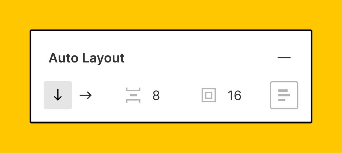
1. Add Auto Layout
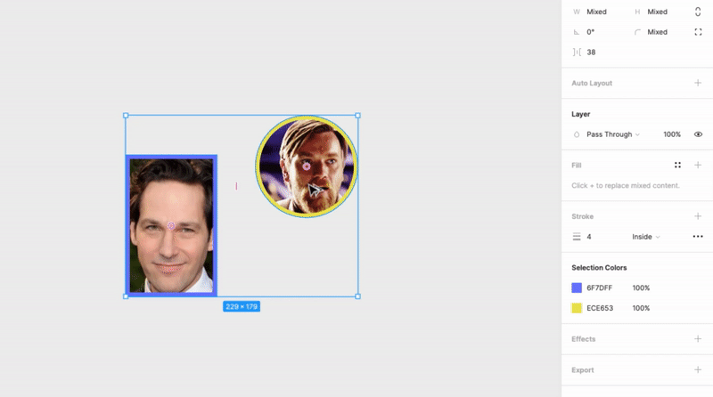
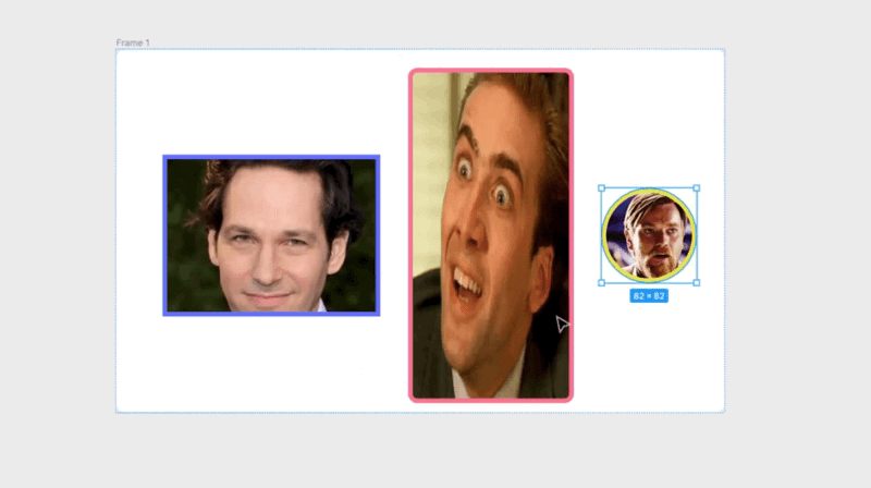
Adding Auto Layout is pretty straightforward and simple. With your Figma canvas open, let's say you have more than one object that you're working with like a rectangular photo of Paul Rudd and a circular object of Obi-wan Kenobi.
So let's imagine selecting those both objects; on the top right-hand side of the window there's a bar where you can select Auto Layout for these two images.
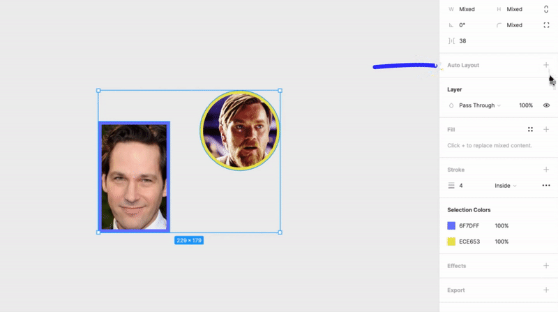
Boom shakalaka Auto Layout is applied to these two objects! It's that simple
For those of you who like options, there is another super-quick way to apply Auto Layout to pair of selected objects and pressing "Shift+A". This will apply the Auto Layout feature, while also turning the objects into a frame (which we will get to later on). Once again, easy as apple pie.
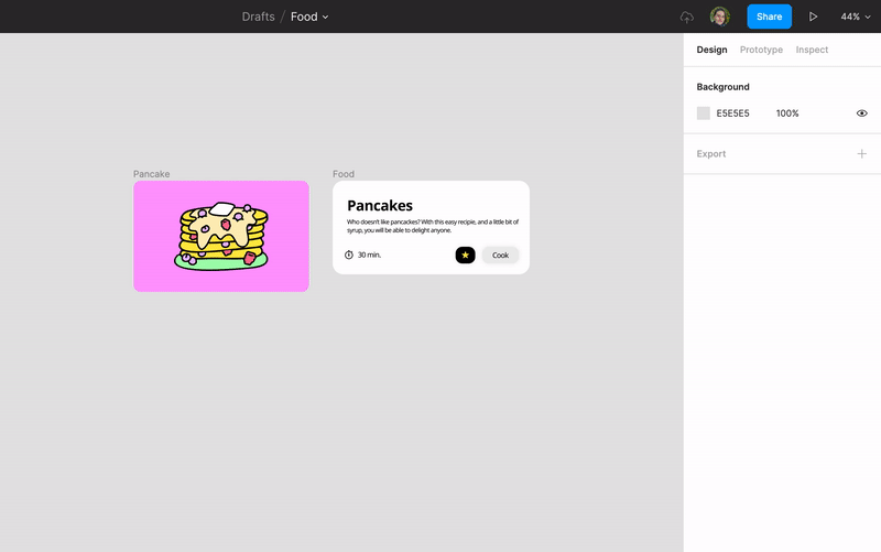
2. Frames and style
A frame is a blue rectangle that will appear when two or more objects are selected. Heading back to the Paul Rudd and Obi-wan elements, after applying the Auto Layout feature, or by selecting two objects and pressing "command+option+G", a frame will appear around these two objects.
Back on the righthand toolbar, you can apply details like colored background by going to 'Fill', clicking on the four squares, and easily choosing the perfect color for the background of the frame. Or, if you aren't feeling sharp corners, you can apply different corner radiuses to make them rounder!
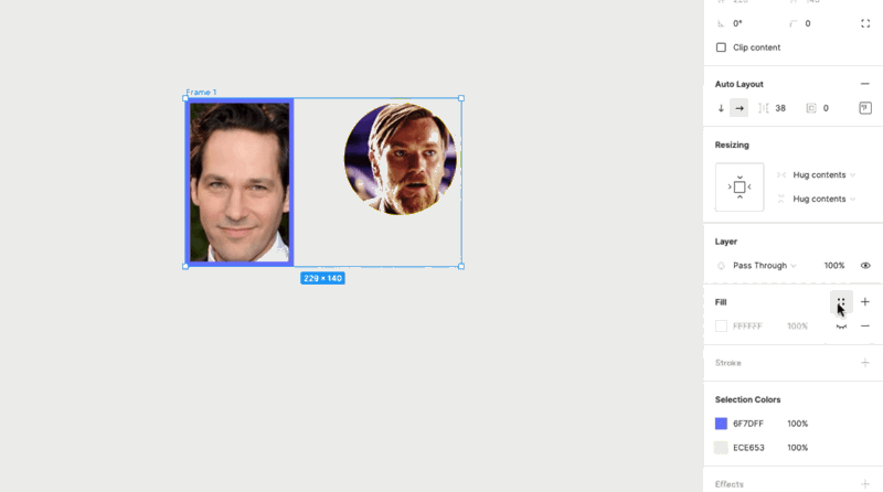
The way you style your frames depends on the project your working on, so feel free to get creative!
3. Elements
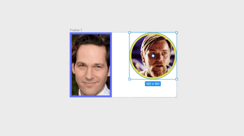
With the elements in our example of the Paul Rudd rectangle and the Obi-wan circle, moving them around in Auto Layout is as simple as clicking on one and dragging it from one side of the frame to the other. Auto layout takes care of maintaining the spacing and alignment, so you don't have to worry about putting something out of place.
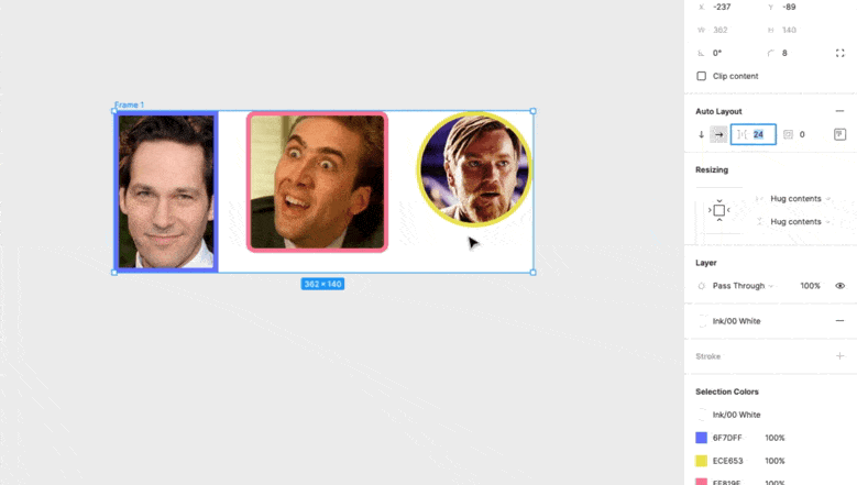
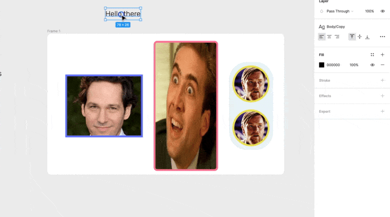
Adding elements into Auto Layout is equally straightforward. For the sake of keeping things aligned with our video, let's say we want to add a classy photo of Nick Cage. Just drop the new element into the frame, and Auto Layout will adapt the new element to the already existing spacing.
If you want to change the spacing between these lovely elements, glance over to the toolbar again where you can find the icons for spacing, and select the number of pixels between elements.
4. Padding, alignment, and resizing
Once again, Auto Layout gives us a ton of control with things like padding (the area in between the frame and the elements).
Not only can you change the padding on all four sides of the frame, but you can also change the padding on individual sides. So if you want more space on the top of the frame, no problem! Or a little less space on the right... GO FOR IT!
In the same part of the toolbar where you can change padding, you can also play with the alignment of your elements. You'll have the option to align things to any part of the frame, so whether it's top-left or center-right, Auto Layout will ensure that the elements stick to that specific configuration.
Auto Layout also lets you change the sizing of the elements inside the frame. You can resize your elements in the toolbar where it says 'Resizing', and if you're looking for one of your elements (let's imagine the Nick Cage photo again) to have the same height as the frame, there are clear and straightforward options for that and other sizing options.
5. Nesting Auto Layout inside another Auto Layout
It sounds like the movie Inception, but you can actually nest an Auto Layout inside a different Auto Layout! What that means is that you can apply the features of Auto Layout to two or more elements that already exist inside a frame that is using Auto Layout.
Just add another circular photo of Obi-wan inside the frame. Next, he selects the two Obi-wan elements and applies an Auto Layout specifically to them.
Now, you can rearrange, change padding, mess with all the other Auto Layout features specifically on these two elements. Pretty nifty, right?
6. Responsive Text
Text acts sort of like another element within Auto Layout. That means that when you add a title, blurb, CTA, or any other text into the frame, the content will respond and stay appropriately formatted within the frame.
Pretty straightforward, but also pretty dope!
So, what do I use Auto Layout for?
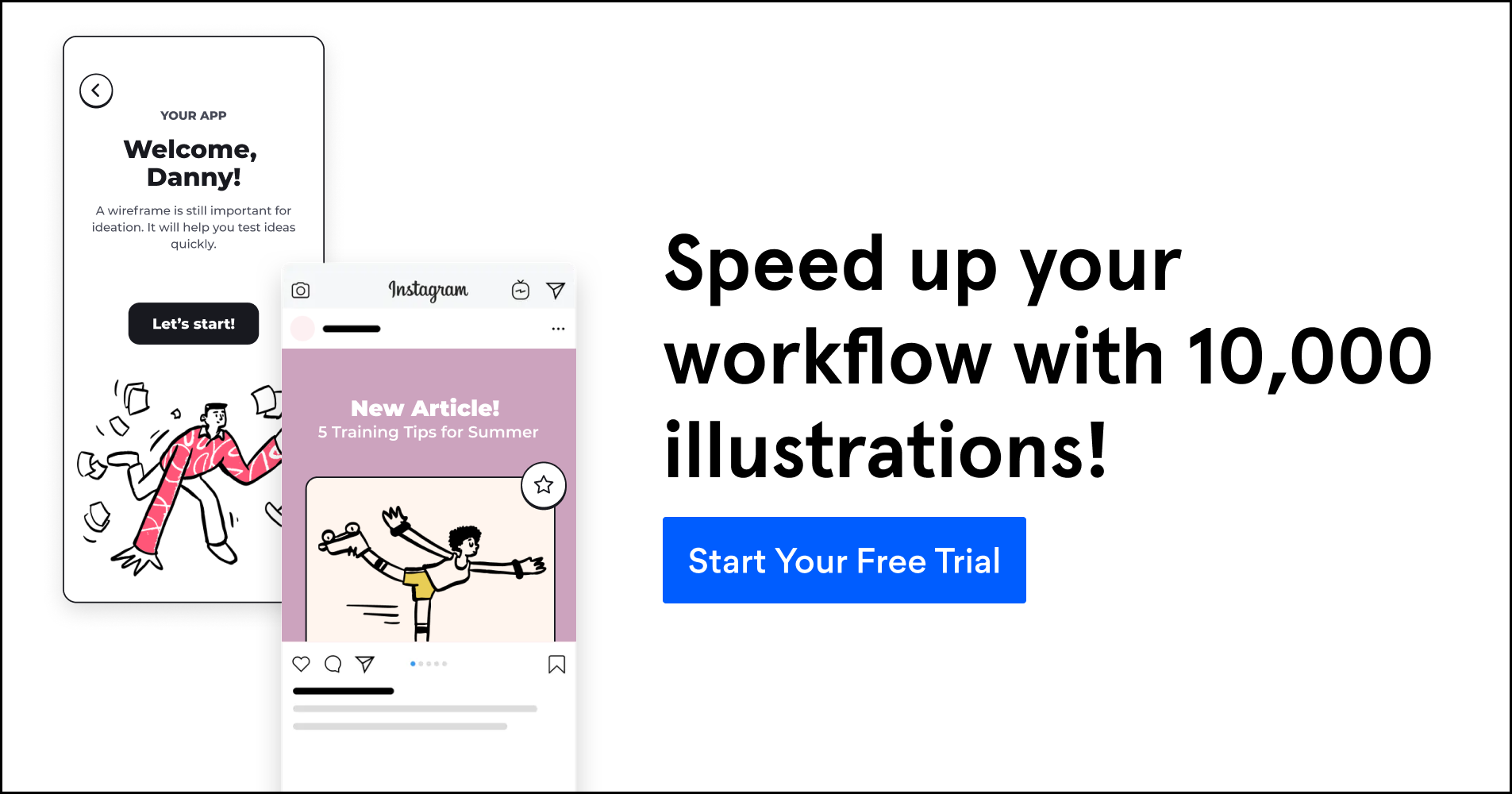
You probably won't be working so much with photos of Nick Cage and Paul Rudd, but you definitely can use Auto Layout for UI design, marketing materials, presentations and more! Check out these dope project examples you can use Auto Layout on:
Auto Layout is like that super useful feature you always wish you had but didn't know existed. The range of ways you can use it will not only open up avenues for your creativity, but it will also drastically improve your workflow.
Don't just take our word for it, give it a try for yourself! Tweet us the projects you've used Auto Layout + Blush illustrations on, because we'd love to see them!